Press, Patience and Printer's Ink: The Somerset Studio Keeping a 500-Year-Old Craft From Going Under
There's a smell in Ruth Calloway's studio that hits you before you've even pushed the door fully open. Ink, oil, and something older — the faint metallic ghost of lead type that's been handled, set, inked, and pressed more times than anyone could reasonably count. It's not unpleasant. It smells, oddly, like history being kept alive on purpose.
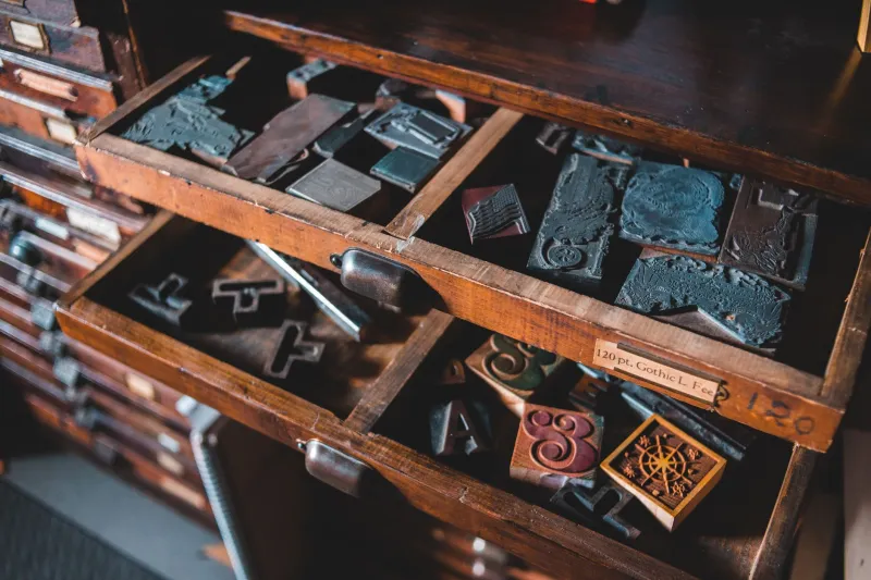
Ruth's studio occupies the ground floor of a converted grain store on the edge of Frome, and it is — by any modern measure — an unlikely place. There are no screens to speak of. No wireless keyboards, no cloud storage, no algorithm deciding what gets made next. What there is, instead, is a 1950s Heidelberg platen press that weighs roughly the same as a small car, several hundred drawers of hand-cast metal type, and a woman who has spent the better part of thirty years learning how to make something beautiful out of both.
"People always expect it to be quaint," Ruth says, not unkindly, pulling on a well-worn apron. "Like I'm running some kind of living museum. But this is a working studio. We've got commissions backed up until spring."
From Redundancy to Revival
Letterpress printing — the process of pressing inked, raised type directly onto paper — is, depending on who you ask, either a dying art or an art in the middle of an unlikely second life. Gutenberg used it. So did every newspaper, every pamphlet printer, every publisher across Europe for the best part of five centuries, right up until the offset litho revolution of the mid-twentieth century rendered it commercially obsolete almost overnight.
For a long time, the presses went quiet. Studios closed. Type was melted down. The skills scattered.
Ruth came to letterpress sideways, through a printmaking degree at what was then Bristol Polytechnic, followed by years of scratching around for work that felt meaningful. She bought her first press — a small tabletop Adana — from a closing printer in Bath in the early 1990s for less than the cost of a decent second-hand bicycle. "I had no idea what I was doing," she admits. "I just knew I didn't want it to be thrown away."
Three decades on, she has four presses, a studio assistant, and a waiting list for her weekend workshops that regularly stretches to four months.
Why Now? Why This?
The revival of letterpress among younger creatives is, on the face of it, a bit of a puzzle. This is a generation that grew up with instant everything — instant communication, instant design, instant print-on-demand. Why would anyone voluntarily choose a process that requires hand-setting individual letters in reverse, inking a plate with a brayer, and running test prints on scrap paper for an hour before you've produced a single finished piece?
Ruth thinks she knows the answer, even if it sounds counterintuitive. "Precisely because everything else is instant," she says. "There's a kind of hunger for process. For things that take time and show it. A letterpress print has an impression — literally, a physical indent in the paper. You can feel it with your fingertip. You cannot fake that."
The tactile quality is part of it. So is the imperfection — the slight variation in ink coverage, the ghost of the type's pressure in the sheet. In a world of pixel-perfect digital reproduction, those small irregularities have become a mark of authenticity rather than a flaw to be corrected.
The wedding stationery market cottoned on to this years ago, and Ruth is honest that commissions for invitations and order-of-service cards keep the lights on. But the work she's most proud of is different — limited-edition poetry broadsides, collaboration with local artists, and an ongoing project printing the words of West Country writers who might otherwise exist only in digital form.
Teaching the Slow Way
Every other Saturday, Ruth's studio fills up. Six people maximum — she's firm on that — gathered around the cases of type and the press, learning to compose a line of text by hand, one character at a time, in a composing stick held in the left hand. It is painstaking. It is done in mirror image. Beginners invariably set at least one line backwards before the morning is out.
"The 'p' and the 'q' thing is real," Ruth laughs. "That's where the phrase comes from, you know — 'mind your p's and q's'. Typesetters had to watch themselves."
Her teaching style is patient but unsparing. She doesn't pretend the craft is easy, and she doesn't romanticise the historical conditions under which compositors worked — bent over type cases in poorly lit print rooms, breathing lead dust, racing against piece-rate deadlines. "This was hard, unglamorous industrial labour for most of its history. It's only now that it's become precious that people have started calling it an art form."
That tension — between craft-as-labour and craft-as-art — runs through everything Ruth does. She charges fairly for her workshops, prices her commissions honestly, and has little patience for the kind of heritage fetishism that treats old skills as décor rather than knowledge.
The Type Stays
One of the more urgent, less visible parts of Ruth's work is the preservation of type itself. Metal typefaces — particularly the more unusual display fonts, the decorative wood type, the ornamental borders — are being lost all the time. Estates clear out old studios without knowing what they have. Type gets sold for scrap. Ruth has rescued several collections over the years, driving her ancient Transit van to Bristol, to Exeter, to a farm outside Shepton Mallet where someone's grandfather had been a jobbing printer.
"Every time a collection goes, that's it. You can't recast most of it. The moulds are gone, the knowledge is gone." She holds up a tray of a particularly fine condensed sans-serif, each letter no taller than a fingernail. "This is probably from the 1880s. Where else is this going to live?"
Here, apparently. In a grain store in Frome, under the care of someone who arrived via a polytechnic printmaking course and a second-hand Adana, and who has no intention of stopping.
The Heidelberg is already inked for the afternoon's run — a short-run poetry pamphlet for a Bristol press, two hundred copies, a single colour. Ruth checks the impression, adjusts the packing, runs a test sheet. Holds it up to the light.
"That'll do," she says. And pulls the lever again.